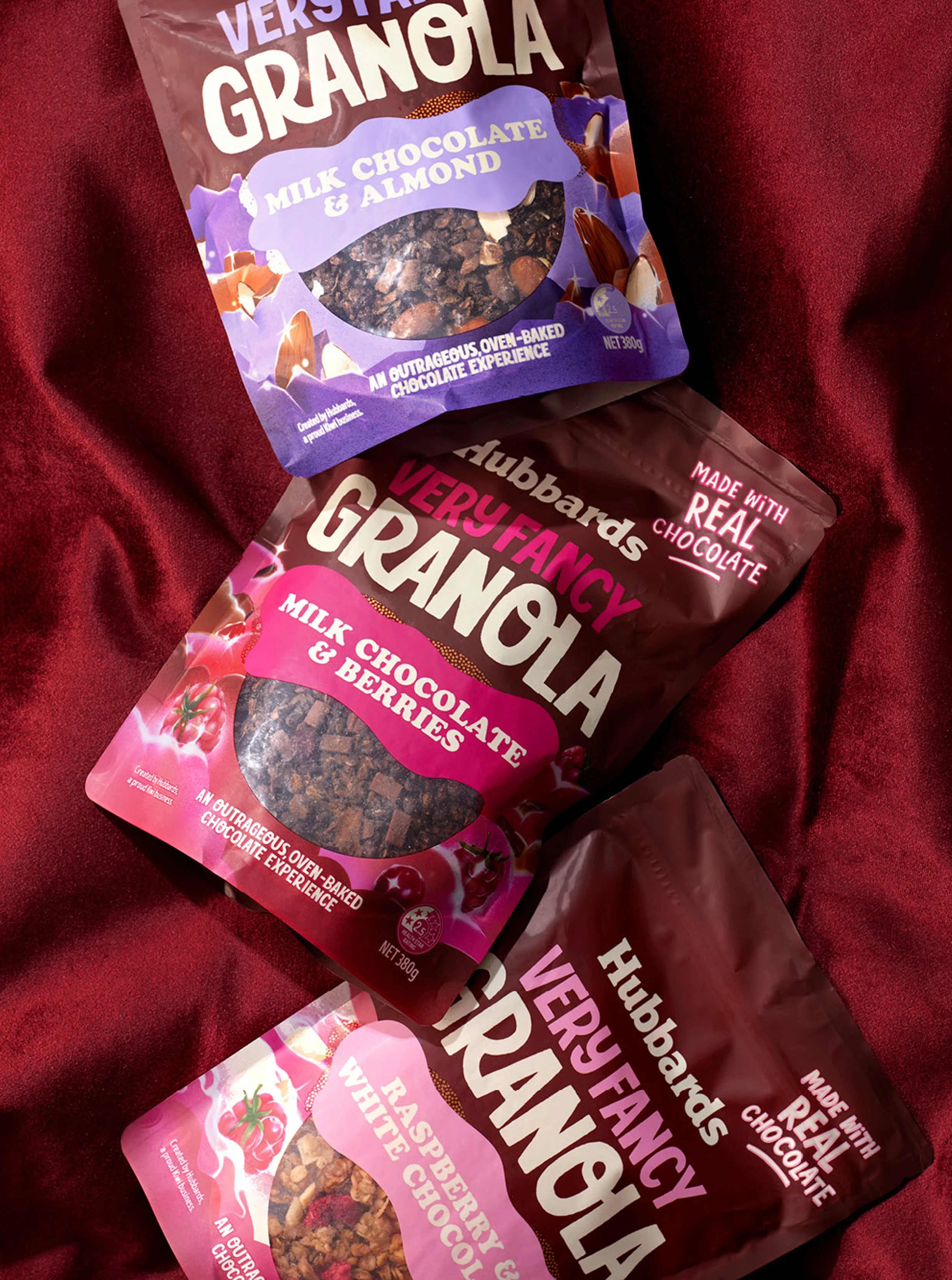
Hubbards Very Fancy
The team at Hubbards got a little bit carried bit carried away in the kitchen. Leaning in to dessert-worthy flavours and and chocolate ingredients they created granolas that were truly OTT decandant experiences. To communicate this for the consume and to differentiate this niche range from the mainstream range, Dark milk chocolate brown replaces the beige. The previously straight rectangle flavour stickers are softened, forming organic shapes referencing soft milk chocolate ingredients. Flavour illustrations are maximalist in style - referencing the lush flavours and a mix of chocolate, granola, nuts and fruit, they are influenced by the psychedelia art of the 1960’s. Oversized ingredients float among ripples and waves of rich and vibrant colours that are playful, as expected from Hubbards, and indulgent.
Onfire Design
Scope: Packaging Design, Illustration
Client: Walter & Wild
Images Copyright of Onfire Design
-
Creative Direction / Matt Grantham
Design / Matt Grantham
Illustrator / Elise Hislop
Copywriting / Bronwyn Williams


